Comparing Oura personal health data over the years
I have been wearing an Oura ring for a few years now to track my nightly sleep, daily activity, and other health variables.
The Oura app works well to track daily, weekly, and monthly differences in these variables but I was lacking a feature to compare my monthly or weekly data over the years.
Visualizing monthly heart rate, year-on-year
As a proof of concept, I visualized my average sleeping heart rate per month and compared these numbers year-on-year. You can find my code on GitHub.
Right now, there is a simple notebook that creates dashboards like this:
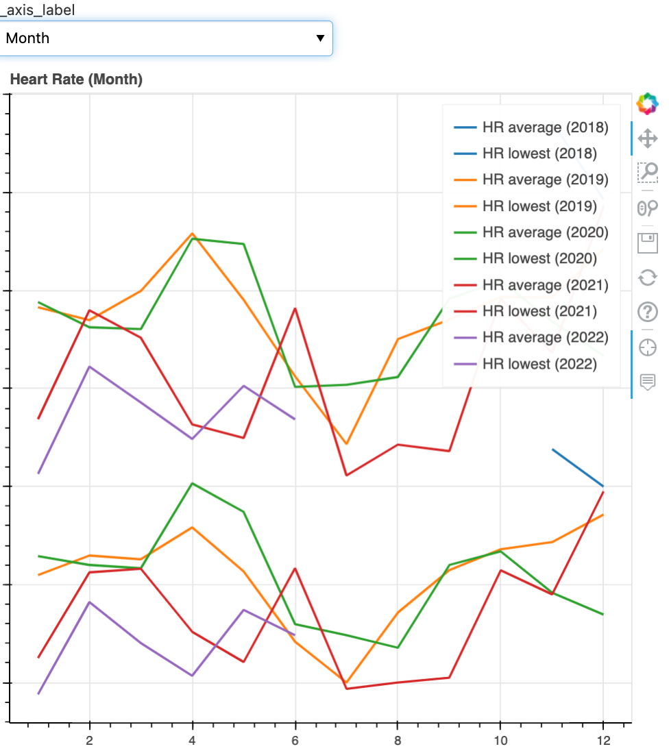
From a technology side, I am querying the Oura REST API using a personal access token, massaging the responses in pandas, and plotting the data in bokeh with a simple dashboard feature added by panel.
Takeaways and next steps
My takeaway from this analysis is that I seem to be on the right track and that my heart rate seems to improve, i.e. lower, over the years in most months. I cut off the exact heart rate in the y-axis labels in the screenshot above for privacy reasons.
Of course, there are many other variables to look at and I plan to work on this dataset more over time. Let me know if you have ideas for what else to look at.


